CLIENT: AT&T
ROLE: One of two user experience designers (Gap'Cork), working with client and agency stakeholders and developers.
TASK: GUILD, a creative agency in New York City, asked us to create user experience designs for the AT&T Media Lab.
The goal was to create the primary interface for a 70" touch screen that interacts with an HD TV wall used to showcase AT&T's advertising opportunities to potential clients.
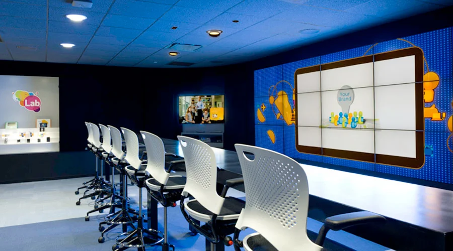
Visiting the AT&T Media Lab
Before designing an experience for a unique physical space, it was important for us to visit the Media Lab and see the layout of the presentation room. In addition to physical limitations, we were also walked through a sample presentation to see how the presentation would take place, and where/how users would interact with the screen in that context.


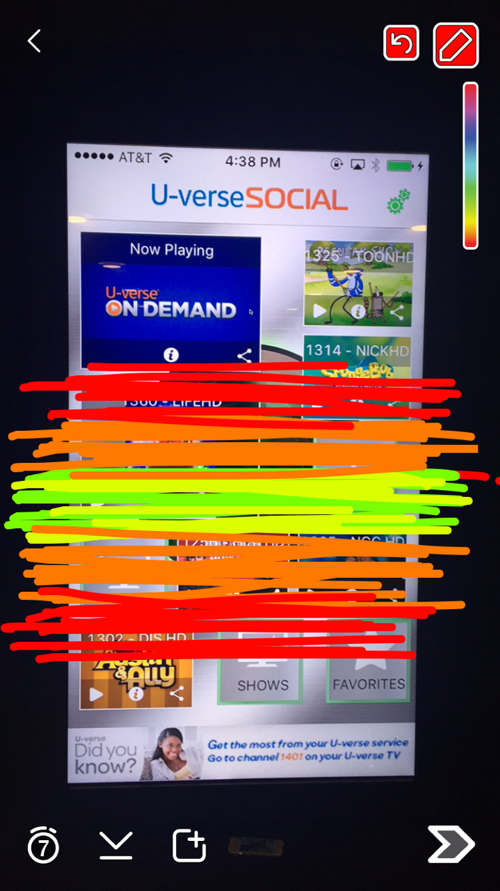
* I used Snapchat to take a photo of different people next to the 70" screen and highlight the "sweet spot" of where the screen was easiest to touch and reach.
Experience Flow
The physical space, and interconnected screens required us to create a detailed experience flow, considering multiple users, devices, and how they interact in the context of a presentation to potential advertisers.


Screen Design
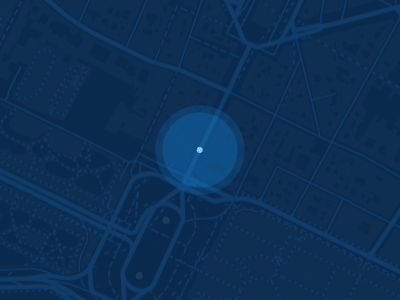
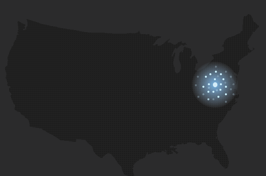
We went through several iterations of screen designs for the 70" touch screen. The first consideration we had to take into account was to design the map and animations in a way that would clearly display the advantages of AT&T's product to potential advertisers. Their value proposition revolves around targeted television ads, which required us to design a screen and animation that conveyed a shift from a weaker, widespread audience to a more condensed target market.
The second consideration was that advertisers participating in the presentation would be interacting with this interface for the first time, in front of a room full of their peers. This context required us to put a greater focus on simplicity and an intuitive path to producing the desired result. In our designs, button states were an important part in avoiding potentially embarrassing mis-clicks or confusion.


Animations
We were also tasked with prototyping potential animations for the screen, most notably a "pulsing" animation to visually convey the targeted nature of their advertising product. We experimented with many different options, looking to different forms of heat maps and data visualizations to draw inspiration from.


Result

The final design was successfully developed and implemented into AT&Ts Media Lab for future presentations. Though the final product was essentially one screen with several states, this project was extremely challenging and rewarding due to the complexity of designing for users interacting with several connected products in a single physical space for the first time - all the while, in front of a group of their peers.
You can read about the product more on AdAge.
Outakes
Here are a few design concepts that did not make it into the final product.


